
You can make a pivot chart to manipulate data collected from a Google Form survey or questionnaire. This is an excellent way to compare groups by using a bar graph. Follow the step-by-step instructions to make your own using existing data collected.
If you are using Google Forms with your students, you have likely read our previous posts: 5 Reasons to Use Google Forms with your Students, 5 More Reasons, and Google Forms and Graphed Results. This post expands on these topics.

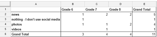
To make the pivot chart in the activity below, you must first have created a pivot table as described in my last post. Pivot charts are another way to analyze data about subgroups in a survey population.
Follow the instructions to create a pivot chart.
- Open the spreadsheet with the responses that you created when making the pivot table.
- To view the pivot table, click the Pivot Table 1 tab at the bottom of the window.
The table should look something like this:
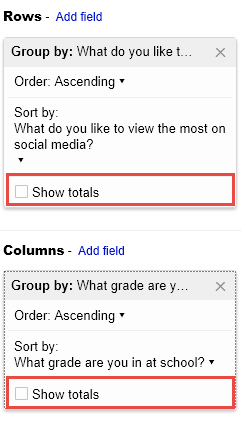
- Remove the Grand Totals:
- In the Rows area, remove the checkmark in the Show totals box.
- In the Columns area, remove the checkmark in the Show totals box.
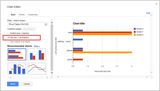
- From the Insert menu, click Chart.
- On the Start tab, click Use row 1 as header to add labels to the legend. Click Insert.
- Drag the chart beside the pivot table.
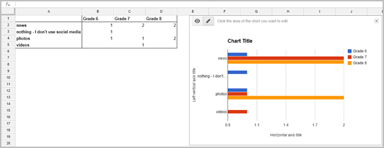
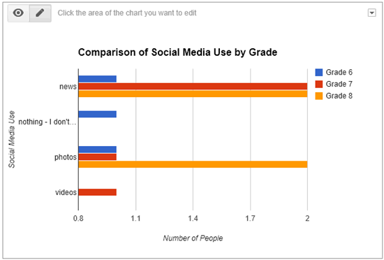
- Select the Chart title. Type Comparison of X by Y. Press ENTER.
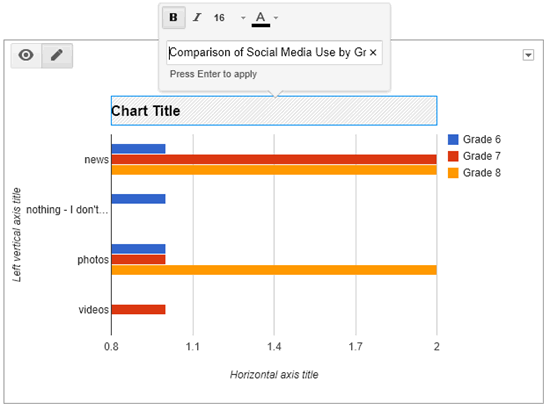
- Click on the Left vertical axis title. Type Description. Press ENTER.
- Click on the Horizontal axis title. Type Number of People. Press ENTER.
- Save the chart: (optional)
- Click the arrow on the top right corner of the chart.
- Select Save image.
Do you prefer a pivot table or pivot chart when comparing data? Why?